Image

Whirligig project

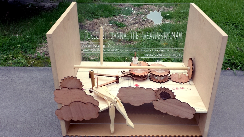
1So for our Mechanics class, we were instructed to make a Whirligig. Basically something powered by some certain mechanisms that produce some sort of result. I decided to base mine off Forecast Janna’s recall animation from League of Legends.

I, however, underestimated how difficult it would be to do her full animation, and only had enough time to execute her leg movements. This was powered by Spur gears, a Geneva wheel mechanism, which was then connected to a Crank Rocker 4 bar linkage. Took quite a while to get all the tolerances right. But all in all I’m just happy it even works! I would have loved to do her complete recall animation, but alas, maybe another time when I’m not under the pressure of a deadline. 🙂

(May upload a video of it working if I can work out how to rotate it – we’ll see)
Image

International Fail Day Poster

International Fail Day Poster

flyer back

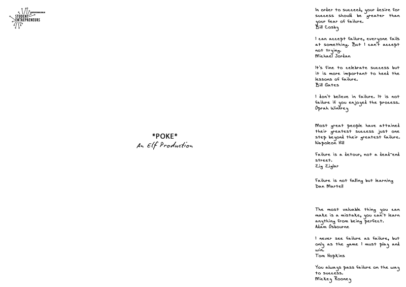
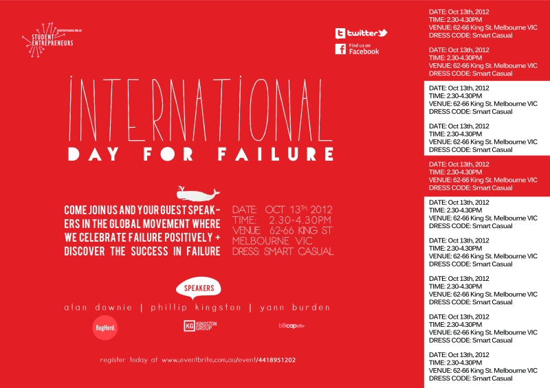
I was asked by a friend studying Commerce to design a poster for “International Fail Day” – an entrepreneurial focused day. It is designed to be put up on pin boards around University. The details of the event are on the right hand side, and are tear offs for any passer-by to retain any information about the event. I specifically requested for the tear offs to have a perforated border, because I wanted the poster to still look like it had a purpose after all the tags were taken off.

On the back of each tear-off I proposed that success/failure quotes would be incorporated. I took my time in searching for quotes that would all be different, because, well, everything is more fun when there’s more variety and less of the same. Probably parallel to this is that no one fails in the same way, and we all have our different ways of getting over it.

Looking back on this, there is probably a lot I would change it better, I am still content with my overall concept of the poster, but as to font choice, and perhaps some placement details I would change were I to have a do-over.

Image

Re-contextualisation

Re-contextualisation

rep2.5 top3.5 explodedg

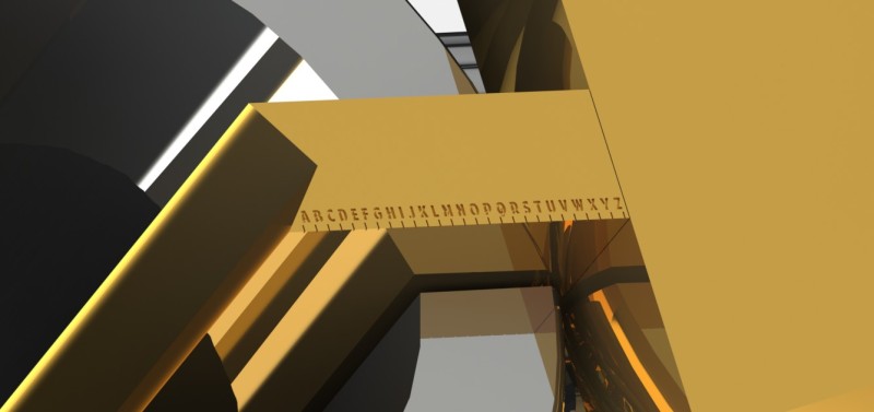
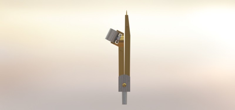
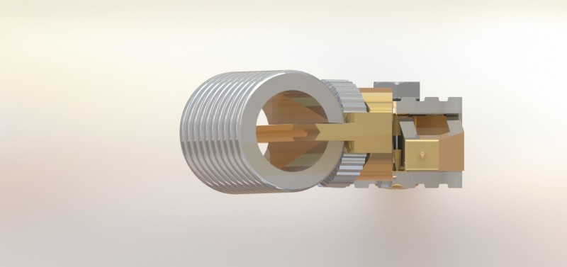
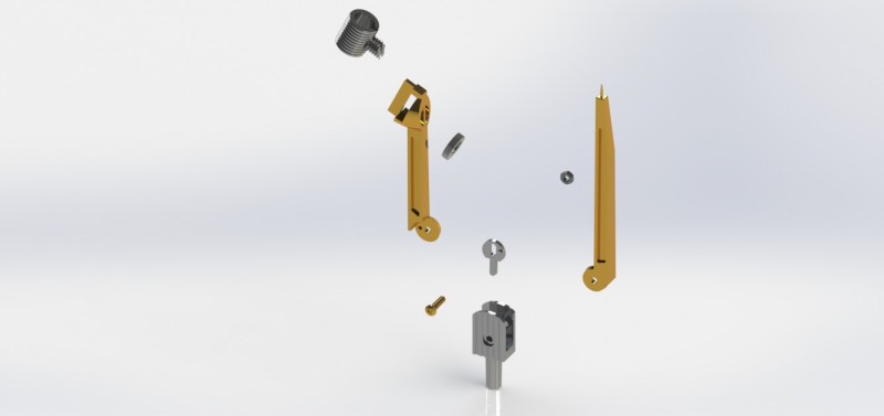
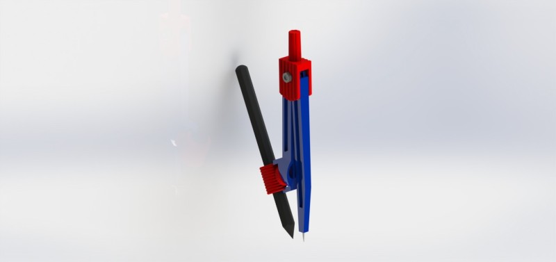
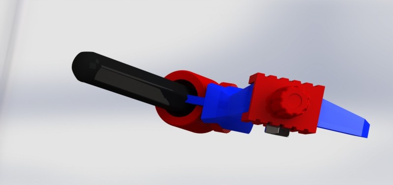
For our solidworks class, we were to pick an object and model it, I decided to choose a mathematical compass – used for drawing nice and perfect circles. After finishing the modelling process, we were given the task of re-contextualising our object. In this case, I opted towards changing the bright plastic parts to classier gold and silver parts, and making my “compass” a “ring measurer”. Now, instead of drawing perfectly round circles, it measures the ring size of a person’s finger.

The original compass is as below:

whole render top view

Image

Placing Materials

Placing Materials

An infographic work made within an Industrial Design studio class. We were required to document everything we touched over a 24 hour period, and this infographic displays information regarding what materials were touched (that i thought relevant) and in what context they were touched.

The beginning of the infographic (left side) is an overall view of the different types of materials touched, with some overlapping. Following this, are materials touched in different contexts. For example, the first one, is materials touched outside, within this, are more numbers which make up the percentage of the materials touched outside.

Some have asked about the last two instances, where I have included knees and feet. Of course, my feet are always going to be touching the ground, but I didn’t choose to record this, what I chose to record with regards to feet was the intention towards the act of doing something with my feet and what it touched. The same goes for my knees.

Please feel free to like or leave any comments. All are welcome.

Mandala

MANDARLA-USB-01

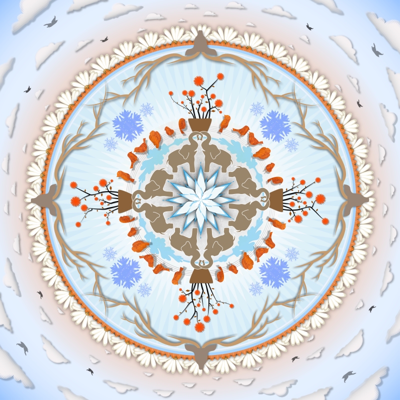
For our first assignment in Illustrator in our digital processes class we made a mandala and chose a theme to base it around. I chose a nature based theme with a few animals that i quite liked.

Image

Postcard

Postcard

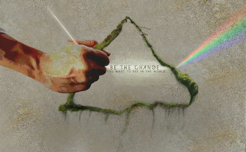
A digital processes class assignment where we were given the task of making a postcard using photo montage, it had to express the phrase we were given to illustrate: “Be the change you want to see in the world”.

I drew my inspiration from the refraction of light, where I sort of re-interpreted the phrase we were given as saying, “if you place input in an active way, you will see change.” This is represented through the light (input) passing through the triangle representation of a prism and being refracted into a rainbow (change). Rainbows are used to represent many movements that are prominent such as the rainbow bracelets being sold against malaria, and in addition, rainbow flags have been used to express ideas of hope throughout the world. I added a personal touch by making my “prism” in which the light refracted through made of moss, because I’m just a bit into being green, as everyone should.

Hopefully that explains it all 🙂